Content design
As the sole content designer on the team, I played a key role in launching bp's latest innovation, the earnify™ app.
earnify™ is an immersive platform designed to consolidate various bp brands into a unified app, including ampm, Thorntons, Amoco, and Arco.
The objective was to enhance the user experience by enabling them to earn points, get exclusive deals, and conveniently pay for fuel all in one place.
In parallel with the launch of earnify™, my role also extended to bolster bp's content design strategies across two continents.
I was responsible for crafting and adapting content that resonated with our diverse audiences in the UK, Germany, Poland, Spain, and South Africa, reinforcing our brand's global presence through thoughtful design.
This was a complex project with a wide scope and many moving parts.
For easier navigation, I've split my process into 7 sections.
01. Overview
02. Objective
03. Research
04. Content
05. Iteration
06. Launch
07. Reflections
01. Overview
-
I was embedded within a team that included a service designer, UX designers, UX researchers, program managers, developers, and design leadership.
-
The project started in December 2023. earnify™ is set to launch at the end of June 2024.
-
Figma, FigJam, Sketch, Mural, Miro, GitHub, PowerPoint, Excel, Word, Zepplin
02. Objective
The strategic goal was to migrate current users, already familiar with brands like ampm, Thorntons, and Amoco within the bp ecosystem, to the new earnify™ app. The purpose of this transition was to offer a more dynamic and improved loyalty program, significantly enhancing their experience.
03. Research
Our research unfolded in three stages:
Stage 1: Market research and competitive analysis
Stage 2: In-person and virtual interviews
Stage 3: Data synthesis and persona creation
Stage 1
I analyzed how companies that consolidate multiple brands under a single umbrella brand navigate user expectations.
-
-How do they communicate their brand?
-Do they use a single voice as a common thread?
-In what situations do they retain distinctive voices and brand-specific terminology?
-What are users saying about their experience?
Stage 2
The participants we interviewed were guests who frequented convenience stores 3 or more times a week and used loyalty apps.
-
-What words do guests use to refer to fuel, snacks, beverages, and hot food?
-What words do guests use when describing a pleasant or unpleasant experience?
-What type of permanent or temporary disabilities do they have?
-What does their journey look like?
-What or who influences their purchasing decisions?
Stage 3
We extracted major themes from our findings, mapped out multiple drafts of the the user journey, and created user personas.
-
Persona: The Budgeter
Description: Strategically planning when and what they purchase for the greatest potential savings
Beliefs: I feel like I'm winning if I get more for my dollar
Behaviors: Plans purchases in advance to maximize savings
Key rewards needed: Clear understanding of dollars saved
Terminology used: Savings, deal, points, dollar, discount
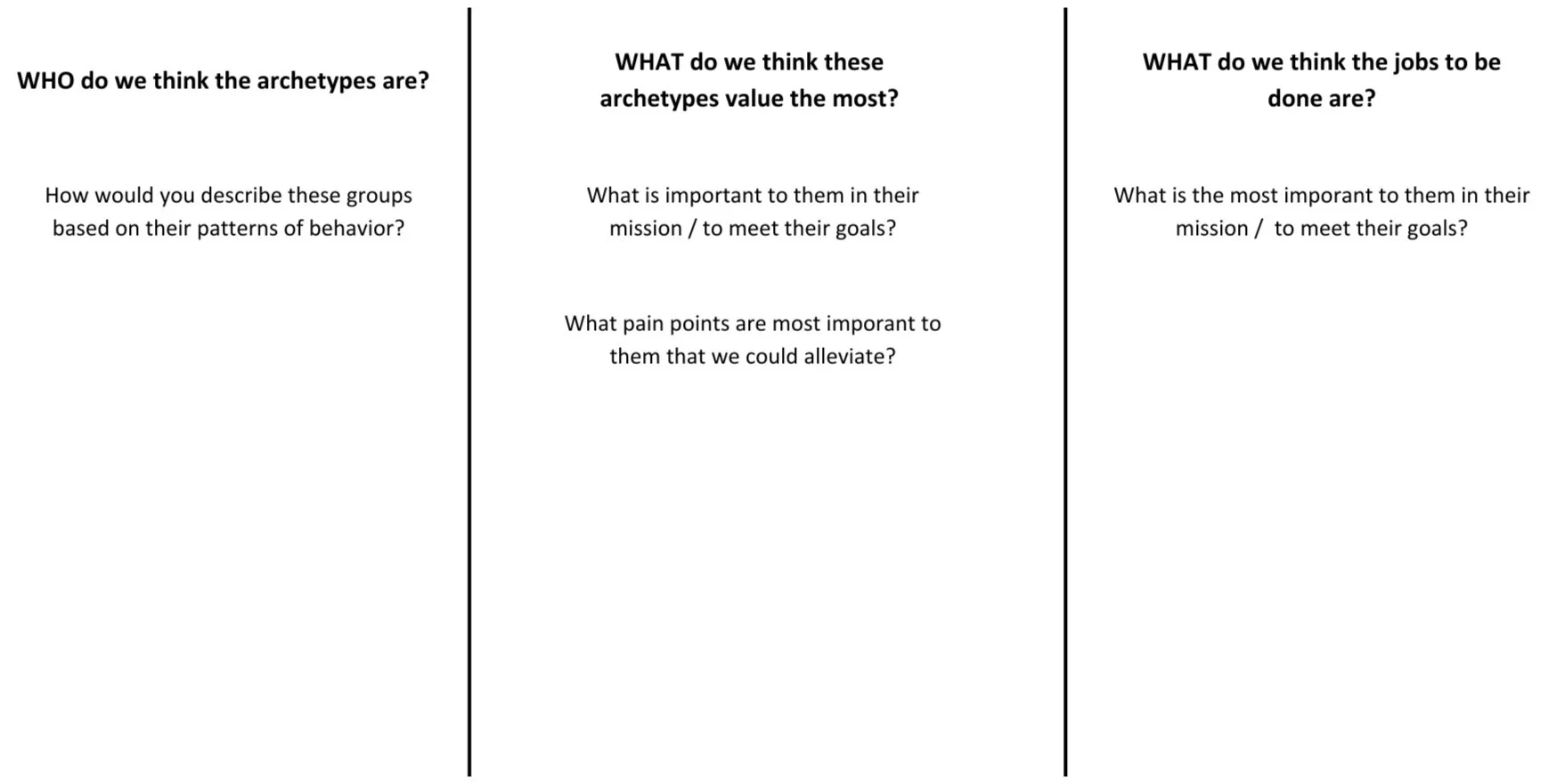
Top-down synthesis
Archetype brainstorm
04. Content
I developed content in alignment with insights gathered from our research and analysis, tailored specifically to meet the needs and characteristics of our user personas.
-
The Information Architecture (IA) for the app is designed to organize, structure, and label content in an effective and sustainable way.
The aim is to help users find information and complete tasks easily.
Here’s a few examples of the IA, with explanations of how each part benefits the user experience:
Home
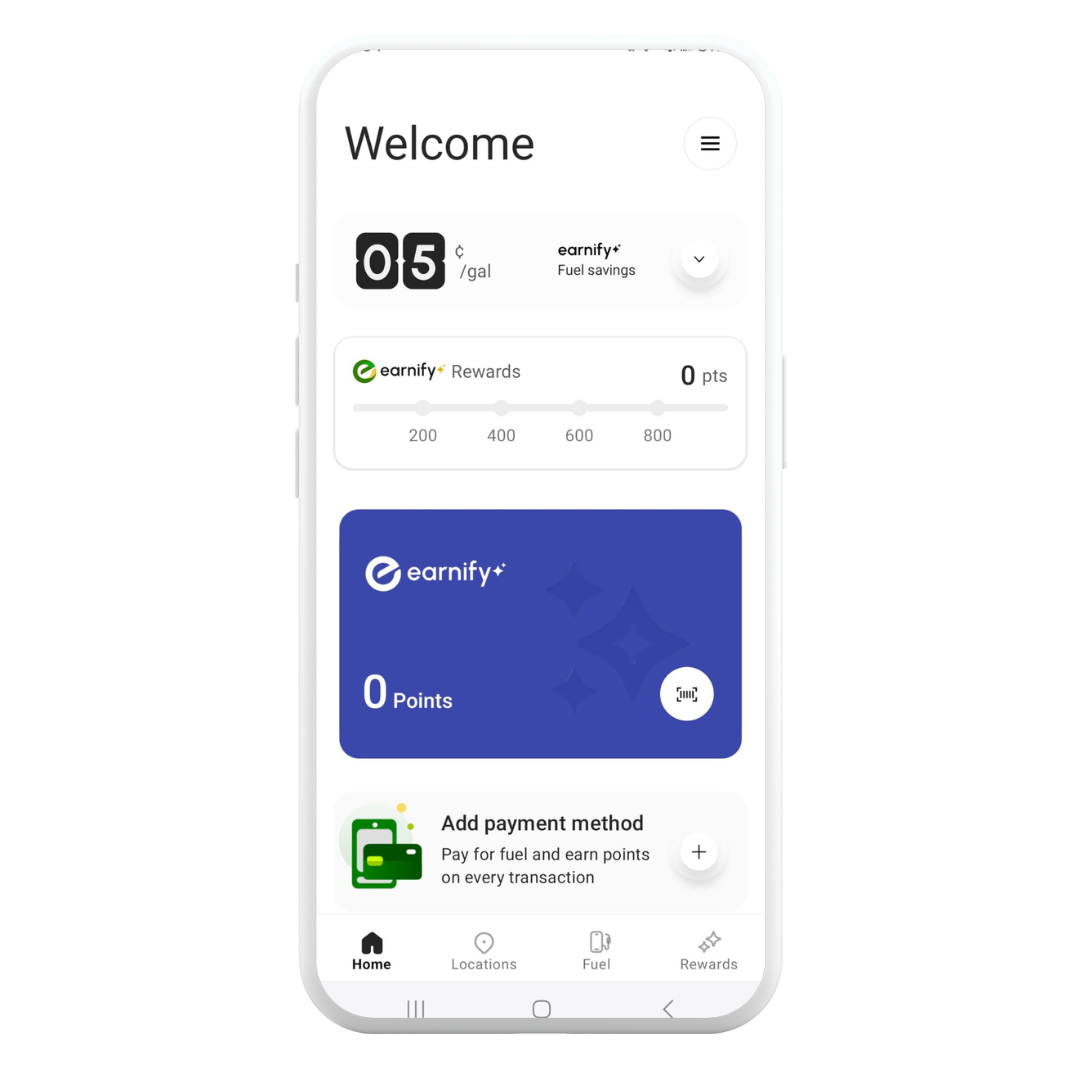
Primary actions: Quick links to essential functions like nearest fuel station, current promotions, and recent orders.
Quick overview: Dashboard showing loyalty points balance, recent activity, and personalized greetings.
Explanation: The Home section acts as a central hub, providing a snapshot of the most relevant and frequently used features, saving time and enhancing convenience.
Fuel services
Find fuel: Locator for nearby stations with map and list options.
Fuel pricing: Real-time prices for various types of fuel.
Mobile payment: Integrated payment solutions for refueling.
Explanation: Organizing all fuel-related activities under one category simplifies the user’s search process, enabling quick decisions and transactions directly related to fueling needs.
Store offerings
Product categories: Divided into snacks, beverages, groceries, etc.
Promotions: Current deals and discounts.
Mobile ordering: Order ahead and pick-up at store.
Explanation: This section helps users explore the store's offerings systematically, improving the online shopping experience and driving sales through easy access to promotions.
Account & settings
Profile management: Edit personal information and payment methods.
Order history: Review past purchases and repeat orders.
App settings: Adjust notifications, app theme, language, etc.
Explanation: Centralizing account management and settings provides users with control and visibility over their personal data and app interactions, fostering a sense of security and personalization.
Location services
Store finder: Search for all store locations with detailed information.
Favorites: Save frequently visited locations.
Amenities information: Availabilities like ATMs, restrooms, etc.
Explanation: Enhances user navigation and planning capabilities, making it easy to access services when on the move.
Rewards & promotions
Loyalty points system: Details on how to earn and redeem points.
Exclusive offers: Special promotions for app users.
Seasonal campaigns: Limited-time events and offers.
Explanation: This section aims to increase user engagement and loyalty by gamifying the experience and offering tangible benefits.
The IA aims to create a clear, user-friendly structure that aligns with the mental models typical convenience store and fuel app users might have.
Each category is designed to facilitate quick access to the most relevant information and functions, encouraging greater app usage and improving overall satisfaction.
-
As a content designer, my wireframe process starts with analyzing the user flow to ensure an informed and content-first design approach. Beginning with low-fidelity sketches and evolving into digital formats, I prioritize content elements based on user needs.
Throughout, collaboration with peers ensures the alignment of design with usability and business objectives, making the wireframes a robust blueprint for developers.
Key Steps in my wireframe design process:
Analyze user flow: Started by understanding the user interactions and basing the initial designs on this foundation.
Sketch and prioritize content: Initially used low-fidelity sketches to experiment with content placement and hierarchy.
Digitize wireframes: Transitioned sketches to digital tools for refinement and adjustment of layouts and navigation structures.
Collaborate for feedback: Engaged with other designers, developers, and stakeholders to refine the designs and ensure they met user needs and project goals.
Finalize design: Ensured the final wireframes effectively blended usability with a strong content-driven focus.
-
I crafted a comprehensive content style guide covering the following areas. For each area, the guide provides a clear introduction, detailing the specifics included, alongside examples illustrating correct versus incorrect applications:
Brand voice and tone
Grammar
Capitalization
Punctuation
Visuals
Active voice
Abbreviations and acronyms
Cultural sensitivity
Social media
Legal and ethical considerations
Visual guidelines
Structure and hierarchy
Numerals
Glossary of terms
-
Developing a nomenclature for a convenience store and fuel app is about defining a clear set of terms and labels that organize app content into logical sections to improve the user interface.
Effective nomenclature tells users what they can find and do within the app. Below are some examples of nomenclature tailored for the app, which is aimed at providing straightforward navigation and enhancing the overall user experience:
Fuel
Location search: Helps users locate nearby stations.
Sort: Allows filtering by fuel type and amenities.
Price check: Displays current fuel prices.
Pay at pump: Mobile payment for fuel.
Pump options: Choose your pump and fuel type.
Payment method: Manage credit cards, app wallet, or discounts.
Shop
Products: Browse items by category.
Food & drinks: Snack, drink, and prepared food options.
Auto items: Car essentials and accessories.
Home products: Emergency supplies and batteries.
Deals: View current specials and discounts.
Order ahead: Place orders remotely for pickup.
Shopping list: Make and share a list of items to buy.
Account
Profile: Edit personal information and settings.
Payment method: Save and manage how you want to pay.
Purchase history: Review past transactions.
Notifications: Set preferences for app alerts.
Help: Access FAQ and contact support.
Rewards
Loyalty program: Join or manage your rewards account.
Promotions: Get the latest deals.
Earn points: Learn how to get more points.
Redeem points: Use points for items or discounts.
This nomenclature focuses on straightforward, easy-to-understand titles that reduce complexity and enhance the user experience by providing clear guidance on where to find services and how to use features within the app.
-
Below is a breakdown of my writing process, followed by an outline of my iteration process.
My writing process
Drafted initial content: I started by crafting the initial drafts for app text. This involved creating text for elements such as navigation, instructions, error messages, labels, push notifications, and informational content within the app. I prioritized clarity and conciseness to guide users efficiently.
Actionable language: I made an effort to use verbs and phrases that motivated user action and facilitated task completion, preferring dynamic wording like "Choose your fuel" over more static options.
Consistency: I maintained consistent terminology throughout the app to prevent user confusion. For example, if I decided on "Top up" for adding funds, I ensured it was used consistently.
User-centered approach: I focused on addressing the users' perspectives and needs in my content, emphasizing what users could achieve with the app, such as encouraging them to "Get started with your first fuel reward."
Microcopy and interface language: When creating microcopy for transactions, I aimed for skimmability and straightforwardness, knowing that users often quickly scanned these texts.
Accessibility: I wrote content that was accessible to all users, including those with disabilities. This involved using clear language and providing alt text for images.
My iteration process
Feedback incorporation: I gathered feedback on my drafts from team members, stakeholders, and during user testing sessions, remaining open to different opinions to refine my content.
User testing: I conducted guerilla-style testing with users using prototypes or wireframes with my text, noting their interaction and any points of confusion.
Refining content: Based on feedback and observations from testing, I refined my content. This involved simplifying language or rearranging information to improve logical flow and integration within the user interface.
A/B testing for conversion optimization: I requested A/B testing for essential sections of the app, like calls-to-action, to determine which versions led to better user engagement. However, due to a limited budget, I was unable to carry out these tests.
Legal and compliance check: I ensured that any content relating to user transactions and data was legally compliant, consulting with legal teams when necessary to ensure accuracy and transparency.
Localization considerations: In preparing content for multiple regions, I considered the need for localized content adjustment based on regional responses to specific phrasing or calls-to-action.
Focusing on a writing and iteration process that emphasized user engagement, clarity, and legal compliance, I enhanced the functionality and user experience of a fuel and convenience store app, creating an intuitive and enjoyable user interface.
Proposed sitemap
Wireframes
05. Iterations
The content was revised multiple times after findings from the following assets were shared:
Research from Thorntons employees and guests
Research from earnify™ usability tests
Finalized user journey from the service designer
Brand voice strategy from an external agency
Stakeholder feedback
06. Launch
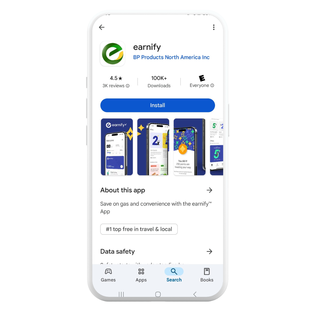
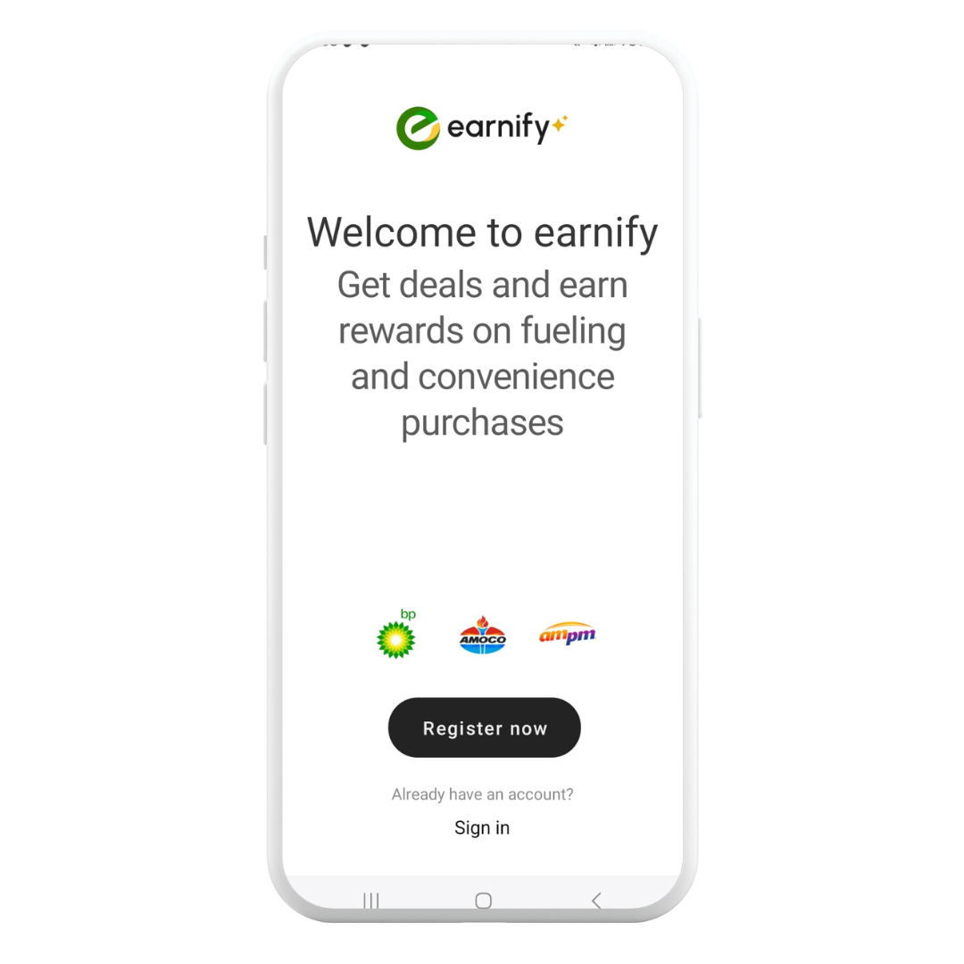
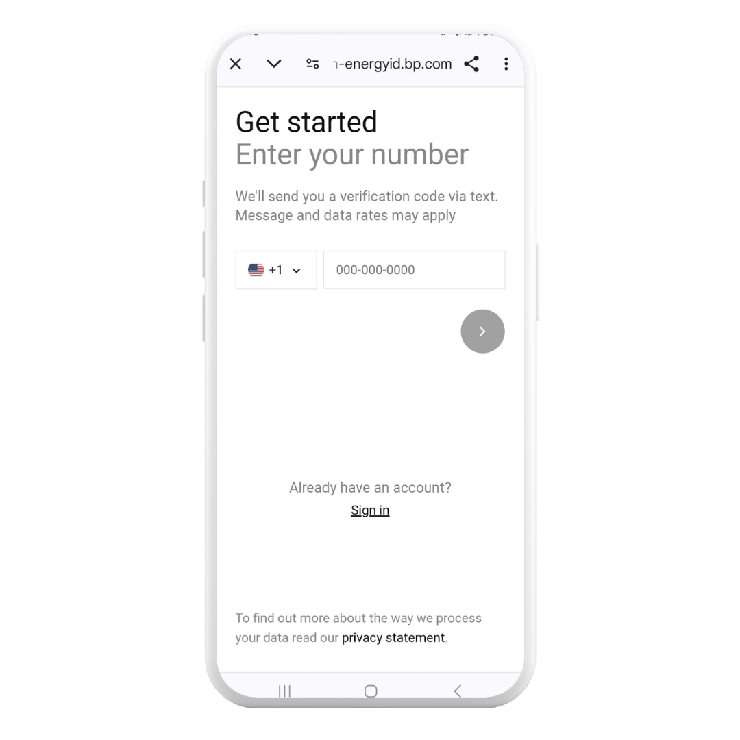
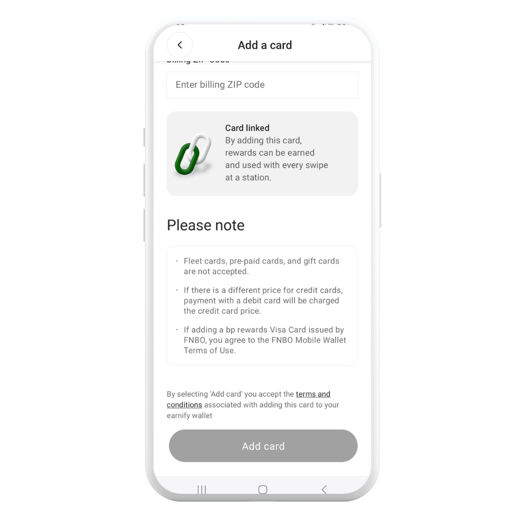
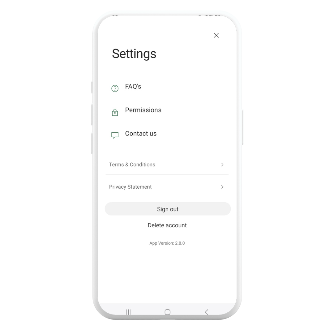
Launched exclusively in select states, the earnify™ app has already surpassed 10 thousand downloads on the Apple Store and on Android devices.
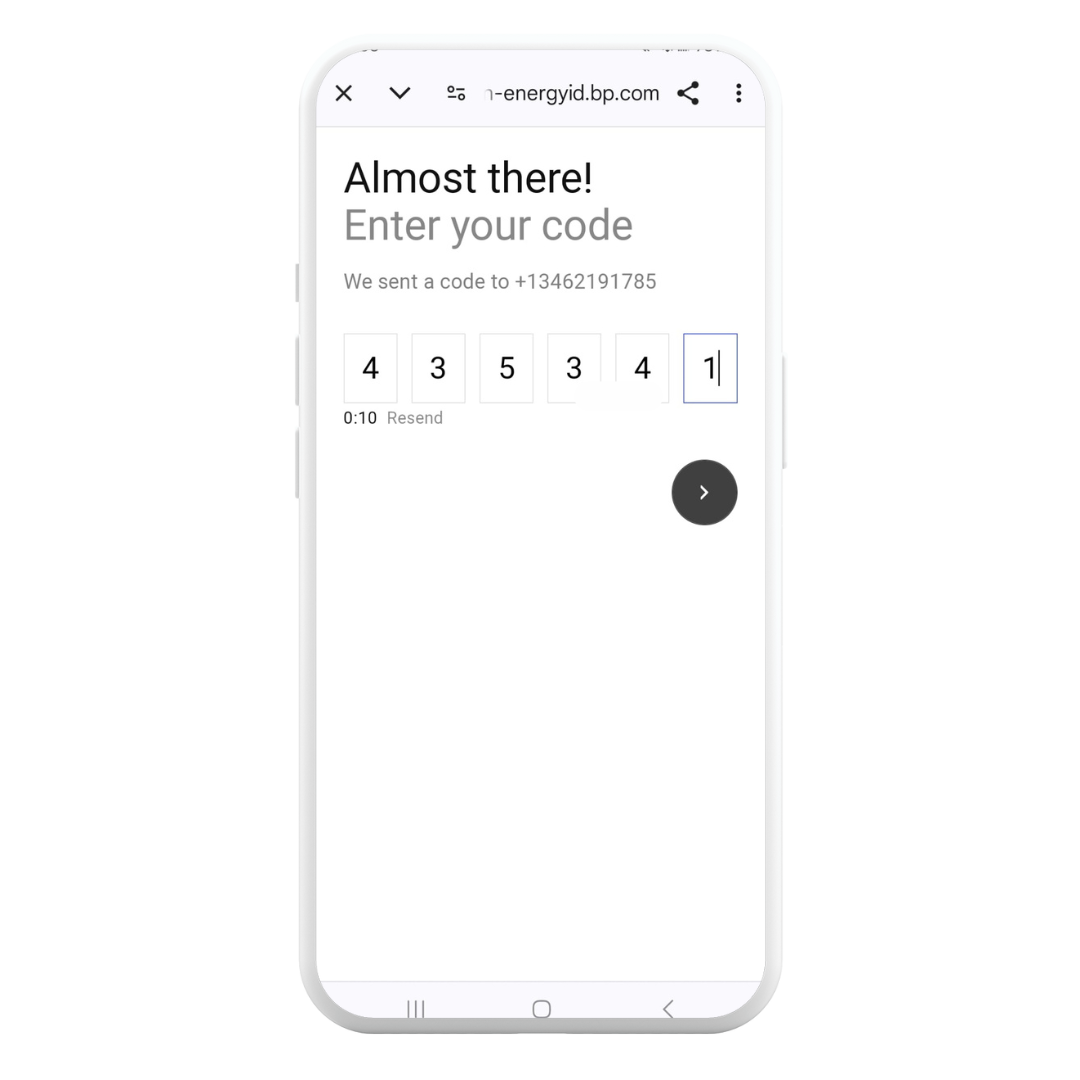
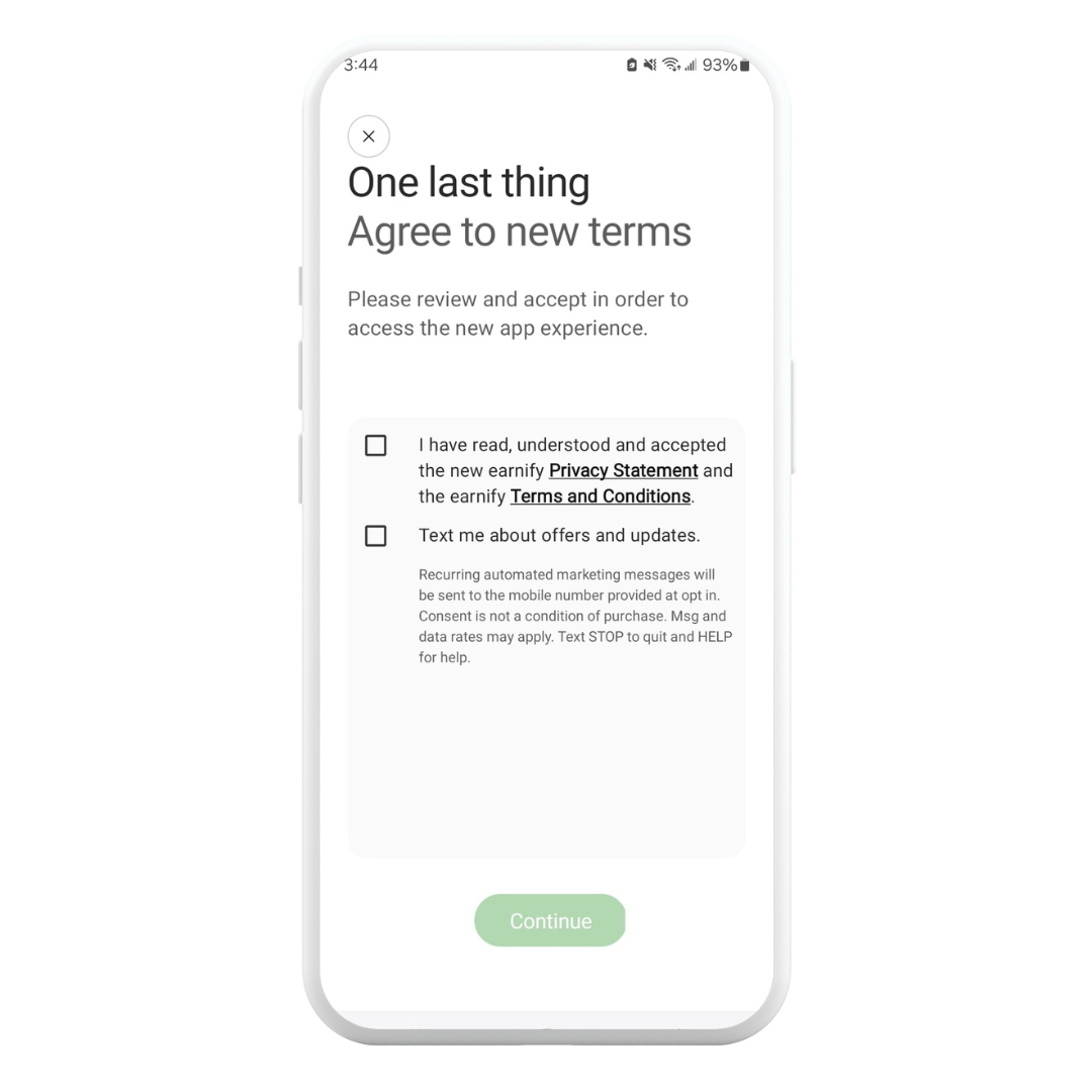
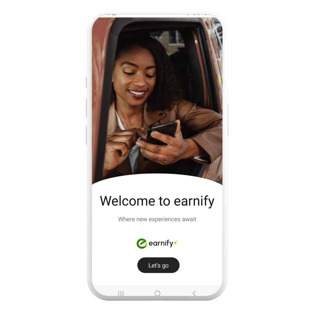
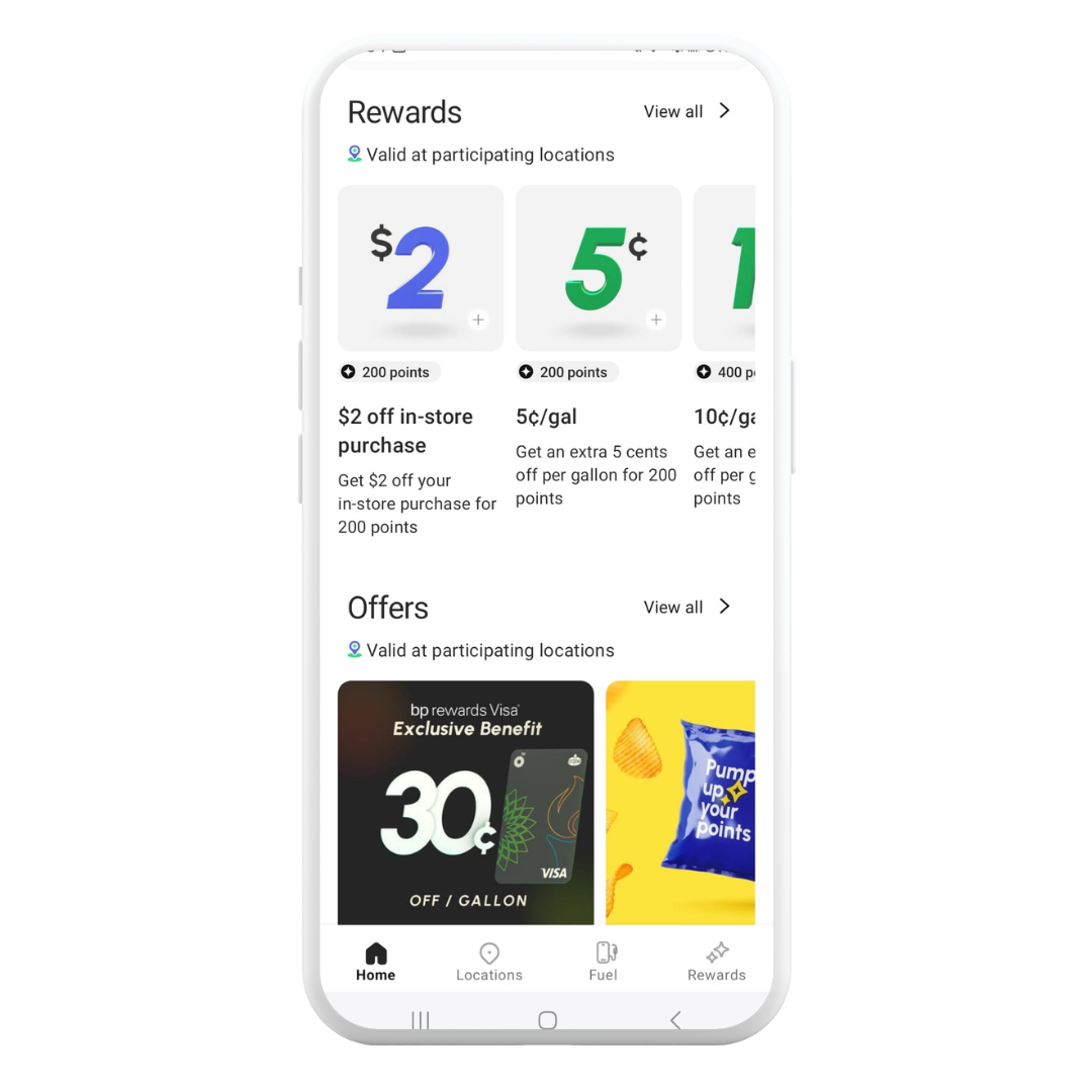
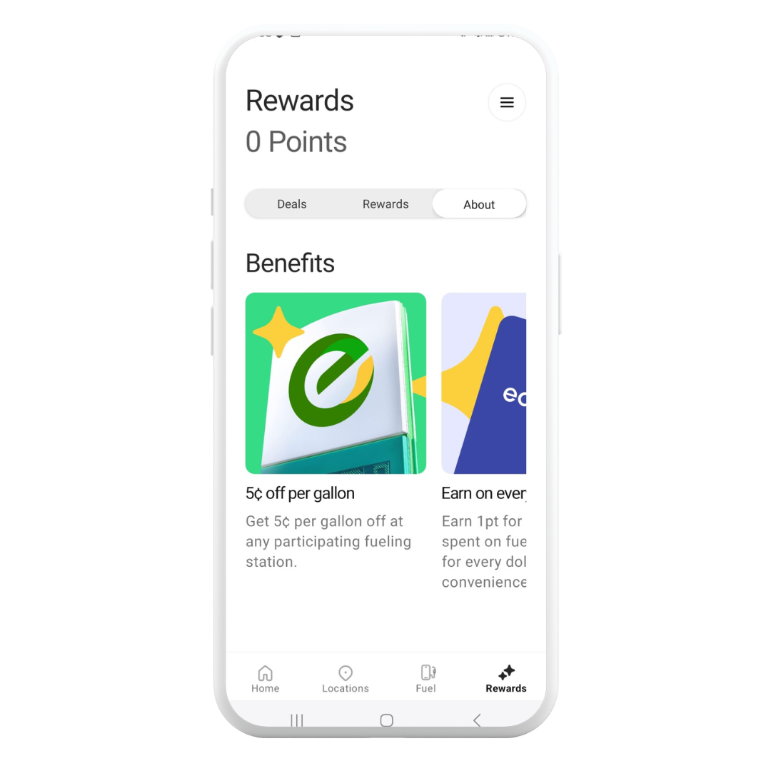
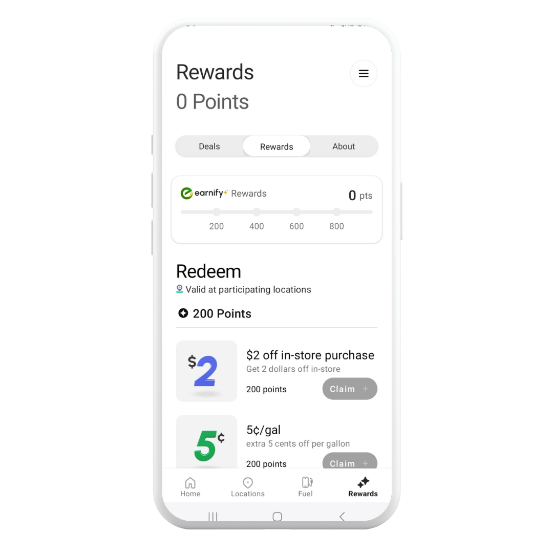
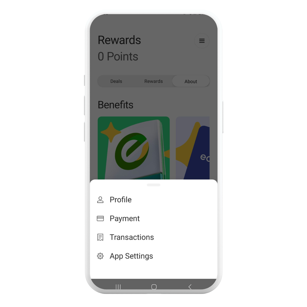
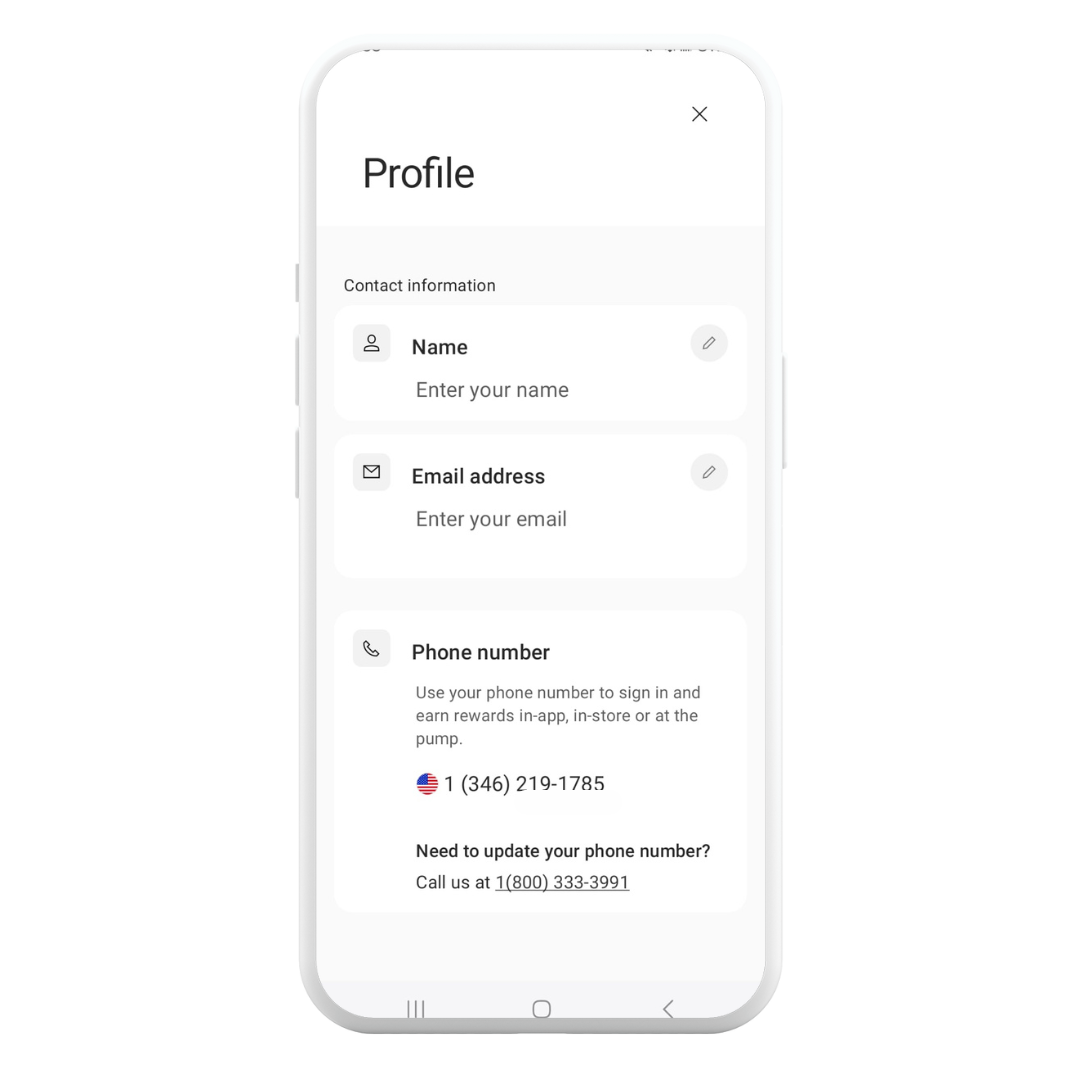
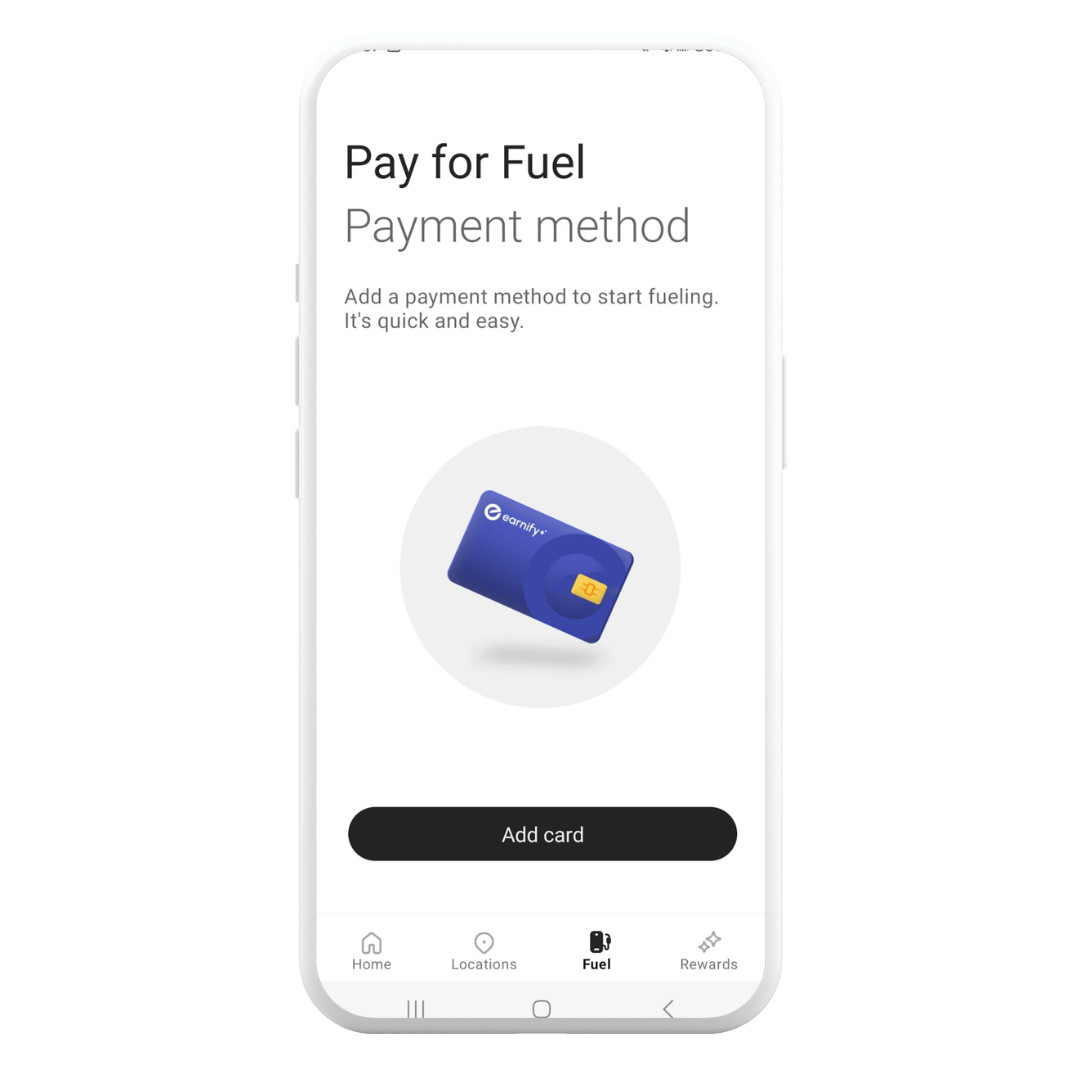
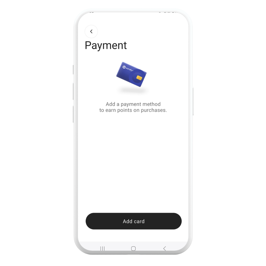
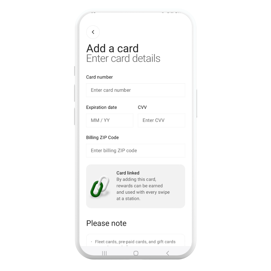
Current iteration
*Please note: Not all these screens are final screens I created.
07. Reflections
The changing priorities demanded that I continually adapt our strategies, which underscored the significance of agility in project management.
Meeting stakeholder demands within a constrained timeline was a challenge that testified to the importance of adaptability and commitment.
Developing a streamlined system was a transformative experience for me. It taught me to value the necessity of clarity and coherence in our methods, confirming that each component contributed meaningfully to the project's overarching goals.
I recognized the value of ensuring content is genuinely useful to the user, making it a cornerstone of my approach. Understanding user experience highlighted how vital relevant content is for boosting user engagement and satisfaction.
The focus on developing reusable UX components opened my eyes to the efficiencies that can be gained from thinking ahead. This approach not only saved resources but also ensured a consistency in user experience that would be beneficial across future project iterations.


